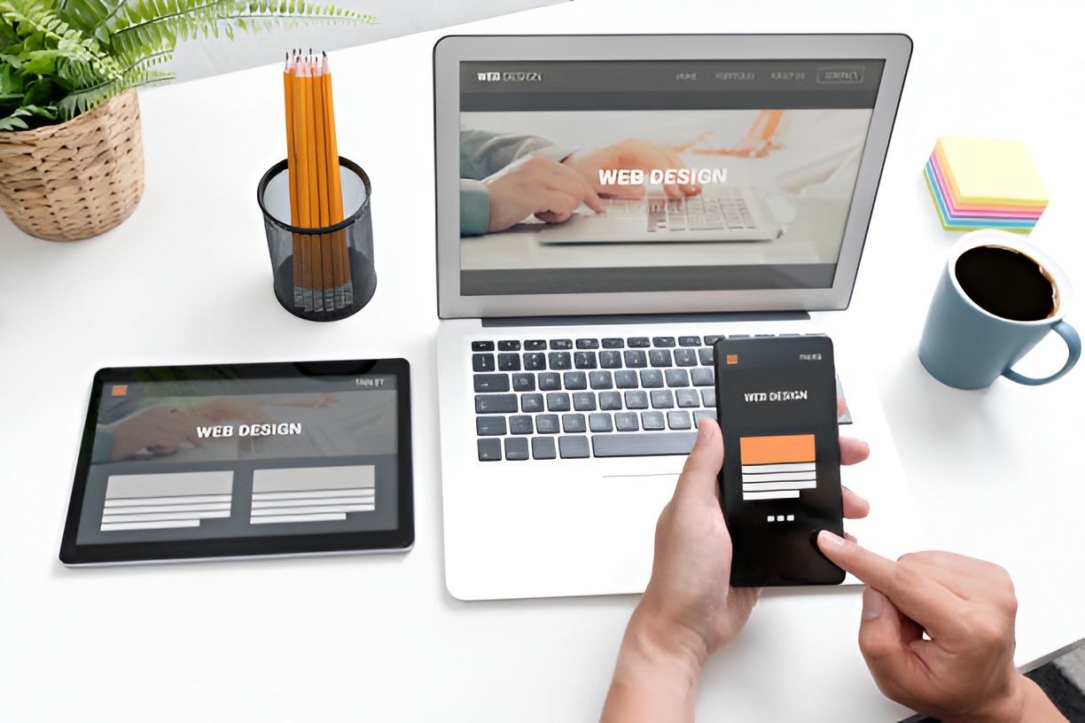
- A well-structured website layout directly impacts user experience, engagement, and conversions for small businesses.
- Core elements like a clear header, hero section, content blocks, CTAs, and footer are essential for an effective website.
- Popular layouts in 2026 include the F-Layout, Z-Layout, Grid Layout, Single-Page Layout, and Asymmetrical Layout, each suited to different business goals.
- Choosing the right layout depends on your business objectives, target audience, content volume, and desired user experience.
- Optimizing layouts for mobile responsiveness, fast loading, clear navigation, and accessibility is critical for modern websites.
- Testing tools like A/B testing, heatmaps, analytics, and user feedback help determine which layout performs best.
- Following current trends such as minimalism, interactive elements, dark mode options, AI personalization, and sustainable design can make your website stand out in 2026.
In 2026, small businesses need websites that not only look great but also drive engagement, conversions, and customer loyalty. With technology evolving rapidly, the right website layout can make a huge difference in how potential customers perceive your brand. This article dives into the best website layouts for small businesses, offering practical insights, tips, and examples to help you create a website that works as hard as you do.
Why Does Website Layout Matter for Small Businesses?
A website layout isn’t just about aesthetics—it directly impacts user experience and business outcomes. For small businesses, your website is often the first impression customers have of your brand. A cluttered or confusing design can turn potential leads away, while a clean, intuitive layout encourages engagement.
Some key reasons website layout matters include:
- Navigation: Helps visitors find information quickly.
- Conversions: Guides users toward desired actions like purchases or sign-ups.
- Credibility: A professional-looking website builds trust.
- Performance: Optimized layouts load faster and work better on all devices.
What Are the Core Elements of a Small Business Website Layout?
When designing a small business website, certain elements are essential to ensure your site is both user-friendly and effective at converting visitors into customers. Here’s a deeper look at each core element:
Header and Navigation
The header is the first thing visitors see and often sets the tone for your entire website. A well-structured header should include your logo, company name, and a clear, intuitive menu. Navigation should allow users to easily access your main pages—like About, Services, Products, or Contact—without confusion. Dropdown menus can be helpful but should remain simple to avoid overwhelming visitors. Additionally, incorporating a search bar in the header can help users quickly find what they’re looking for, especially on content-heavy sites.
Hero Section
This is the top portion of your website that users see first. A strong hero section immediately communicates who you are and what your business offers. It can include a bold headline, a brief description of your services, and a high-quality image or video that reflects your brand personality.
The hero section often contains a call-to-action (CTA) as well, encouraging visitors to take the next step, such as scheduling a consultation, viewing products, or signing up for a newsletter. Remember, first impressions matter—make this section visually appealing and instantly informative.
Content Sections
Content sections break down your services, products, or offerings into digestible blocks. Use headings, subheadings, bullet points, and images to make content scannable. Incorporating multimedia—like videos, infographics, or interactive elements—can help explain complex services or showcase your work.
For example, a local café might include a section with high-quality images of menu items, customer testimonials, and a short story about the brand. Organized content sections not only improve user experience but also contribute to SEO by structuring your content for search engines.
Call-to-Action (CTA)
CTAs are the driving force of conversions. Buttons or links should stand out visually and clearly communicate what action you want visitors to take. Examples include “Book a Free Consultation,” “Shop Now,” or “Sign Up for Our Newsletter.”
Placement is key—CTAs should appear in multiple strategic locations, such as the hero section, middle of pages, and at the end of content blocks. Use actionable language that creates urgency or highlights a benefit.
Footer
The footer is often overlooked, but it’s a critical element for both user navigation and SEO. Include links to important pages, contact information, social media profiles, and sometimes a newsletter signup form.
A consistent, organized footer helps visitors quickly find information without scrolling back to the top. You can also use it to reinforce branding or highlight special offers.
What Are the Most Popular Website Layouts in 2026?
The right layout can significantly influence how users interact with your website. Here’s an in-depth look at the most effective layouts for small businesses in 2026:
1. The F-Layout
The F-Layout mimics the natural reading pattern of users—scanning across the top horizontally and then down the left side. It’s ideal for content-heavy sites where conveying information efficiently is crucial.
Why it works:
- Users naturally follow an “F” pattern, making key information visible where their eyes are most likely to go.
- Headlines, navigation menus, and CTAs are prioritized without overwhelming the visitor.
- Easy to implement across desktop and responsive layouts.
Pros:
- Scannable content makes it easy for visitors to find information quickly.
- Highlights important elements like service details, promotions, or blog posts.
- Works well for blogs, portfolio sites, or service-oriented businesses.
Best For: Small businesses that rely on content marketing, educational materials, or detailed service explanations.
2. Z-Layout
The Z-Layout guides users’ eyes in a zig-zag pattern, from top-left to top-right, then down diagonally, finishing at the bottom-right. This layout is excellent for landing pages and homepages aiming for conversions.
Why it works:
- It directs attention to key elements, especially CTAs, by following natural eye movement.
- Balances visuals and text effectively, preventing pages from feeling cluttered.
- Can enhance storytelling by guiding users through content in a structured way.
Pros:
- Maximizes engagement by placing important information along the eye path.
- Ideal for showcasing products, services, or promotions.
- Improves conversion rates on landing pages.
Best For: Small businesses focused on lead generation, online sales, or capturing sign-ups.
3. Grid Layout
Grid layouts organize content into neat, evenly spaced blocks. They are highly versatile, visually clean, and responsive across devices, making them a favorite for modern business websites.
Why it works:
- Organizes content consistently, improving readability and visual appeal.
- Makes scaling and updating content simple without breaking design flow.
- Offers flexibility for mixing images, text, and multimedia content in a balanced way.
Pros:
- Clean, organized look enhances professionalism.
- Easy to adapt for mobile responsiveness.
- Ideal for showcasing multiple products or service categories.
Best For: E-commerce stores, creative agencies, or businesses with extensive portfolios.
4. Single-Page Layout
Single-page layouts consolidate all content into one scrollable page. This approach works well for small businesses with a clear message or limited offerings.
Why it works:
- Offers a smooth, continuous browsing experience without requiring navigation to multiple pages.
- Perfect for storytelling, showcasing services sequentially, or highlighting a single campaign or product.
- Reduces confusion by keeping everything in one place.
Pros:
- Engaging and easy to follow, especially on mobile devices.
- Encourages visitors to scroll through your key messages.
- Streamlined design simplifies maintenance.
Best For: Local businesses, startups, event promotions, or small service providers.
5. Asymmetrical Layout
Asymmetrical layouts break the traditional grid, creating unique, eye-catching designs. They are ideal for businesses wanting to convey creativity or modernity.
Why it works:
- Draws attention through contrast, spacing, and unexpected visual elements.
- Guides users’ eyes naturally using size, color, and hierarchy rather than strict alignment.
- Engages visitors by making the browsing experience feel dynamic and less predictable.
Pros:
- Stands out from standard grid layouts.
- Encourages creativity and brand personality.
- Works well for portfolios, creative agencies, or innovative product showcases.
Best For: Designers, marketing agencies, and small businesses looking to differentiate themselves visually.
How Do You Choose the Right Layout for Your Business?
Selecting the best website layout depends on your business goals, audience, and type of content. Here are some guiding questions:
- What is the primary goal of your website? Lead generation, e-commerce, or information sharing?
- Who is your target audience, and what devices do they use most?
- How much content do you have, and how should it be organized?
- Do you want a traditional, minimalist, or modern aesthetic?
Answering these questions helps narrow down which layout will be most effective.
Tips for Optimizing Website Layouts in 2026
Even the best layout won’t work if it’s not optimized for modern web standards. Keep these tips in mind:
- Mobile-First Design: Ensure your site looks and functions perfectly on smartphones and tablets.
- Fast Loading Times: Use compressed images, minimal scripts, and caching to improve performance.
- Clear Navigation: Avoid cluttered menus and provide a clear path to important pages.
- Visual Hierarchy: Use headings, spacing, and contrasting colors to guide users naturally.
- Accessibility: Include alt text, readable fonts, and color contrast to accommodate all users.
- Consistent Branding: Keep colors, fonts, and imagery aligned with your brand identity.
How Can Small Businesses Test Which Layout Works Best?
Testing is crucial to determine which layout generates the best results. Some methods include:
- A/B Testing: Compare two layout versions to see which performs better.
- Heatmaps: Tools like Hotjar or Crazy Egg show where users click and scroll most.
- User Feedback: Ask customers or website visitors for input on usability.
- Analytics: Monitor bounce rates, page visits, and conversions to measure effectiveness.
Common Mistakes to Avoid in Website Layouts
Even small businesses with a great product can lose visitors if their website layout is poorly designed. Avoid these pitfalls:
- Overcrowded pages with too much text or imagery.
- Confusing navigation or too many menu items.
- Ignoring mobile responsiveness.
- Using too many fonts or clashing colors.
- Forgetting clear calls to action.
What Trends Are Shaping Website Layouts in 2026?
Staying ahead of trends ensures your website feels modern and relevant. Key trends include:
- Minimalism: Less clutter, more whitespace, and focus on essential content.
- Interactive Elements: Micro-animations, hover effects, and scroll-triggered interactions.
- Dark Mode Options: Providing light and dark versions for user preference.
- AI-Driven Personalization: Dynamic layouts that adjust content based on user behavior.
- Sustainability-Focused Design: Lightweight sites that reduce energy usage and carbon footprint.
Final Thoughts: Creating a Website That Works for Your Business
Choosing the best website layouts for small businesses in 2026 means balancing aesthetics, functionality, and business goals. Whether you prefer a traditional grid layout, a dynamic asymmetrical design, or a simple single-page approach, the key is creating a site that your visitors can navigate easily and enjoy interacting with.
Remember, your website is not just a digital brochure—it’s a tool to build trust, engage customers, and drive growth. Prioritize usability, responsive design, and clear calls to action, and your website will serve as a powerful extension of your brand in 2026 and beyond.


